Retail Operations Dashboard
2026-07-22
From a million messy real invoice lines to a four-view decision dashboard, with every cleaning choice counted and every KPI defined and tested.
dashboards streamlit data cleaning kpi design
Problem
An operations lead compiling monthly numbers by hand needed one trustworthy screen: revenue trend, product and market drivers, the returns picture, and which customers deserve which treatment. Dashboards fail more from unclear purpose than bad charts, so every view had to answer a stated question.
Data
UCI Online Retail II (Public and real, 1,067,371 invoice lines, UK online retailer, 2009 to 2011)
Approach
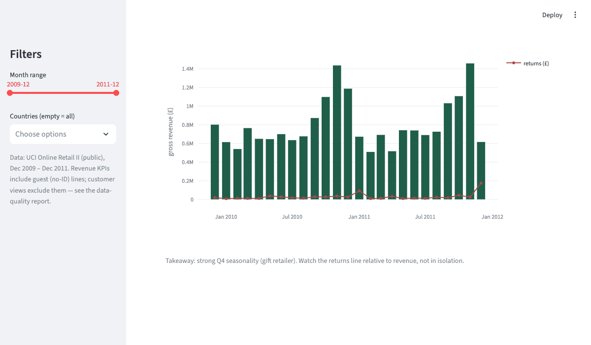
An audited cleaning pipeline where every excluded line is counted (cancellations kept as returns, non-product codes and bad prices removed) and the signature judgment call: 22% of lines have no customer ID, so revenue KPIs keep them but customer analytics cannot. A unit-tested KPI layer, a documented star-schema model (with Power BI and DAX translations), RFM segmentation, and a four-view Streamlit and Plotly dashboard.
Result
£20.1M revenue with strong Q4 seasonality, a stable 3.6% return rate concentrated in a few products, about 84% UK revenue, and 1,476 “Champion” customers (of 5,852 identified) accounting for roughly £12.1M, each segment mapped to an action. The average order value of £509 exposes wholesale buyer behaviour worth flagging.
demo video
a short recorded walkthrough goes here once the project is complete
What I'd do differently
The dataset is 2009 to 2011, so the method is current but the market facts aren't, and every view is revenue-only. Cost and margin data would turn the returns and Champions views into genuine profit conversations.