Interactive Dashboard
2026-08-15Planned
A dashboard that turns a raw dataset into a small set of decision-focused views, with notes on the metric choices and design decisions behind it.
visualization dashboards streamlit metrics
Planned — write-up coming
This write-up will be completed as the project is finished. The sections below show the problem and intended approach; results only get added once they’re real.
Problem
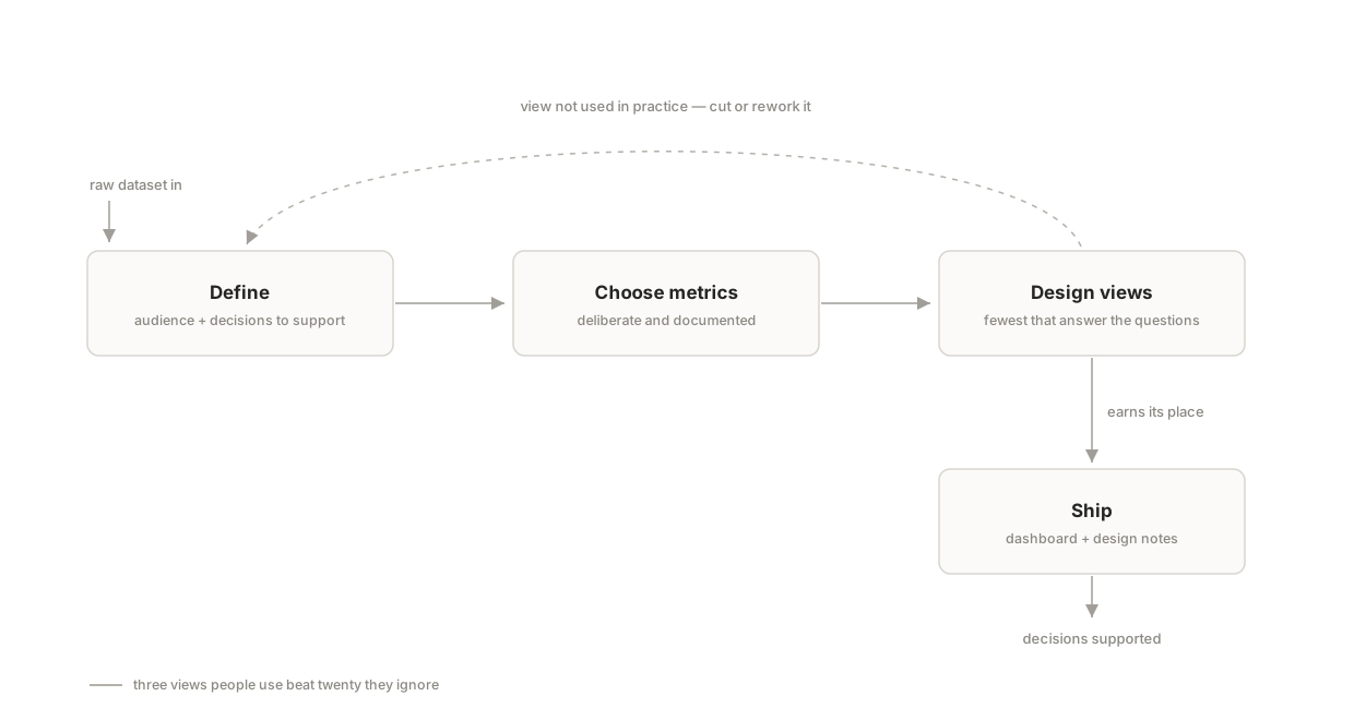
Dashboards fail more often from unclear purpose than from bad charts — twenty views nobody reads instead of three that answer real questions. This project builds a dashboard the way an analyst embedded in a team would: define who it's for and which decisions it supports, then design the smallest set of views that serves them. [PLACEHOLDER: name the dataset and audience once chosen.]
Approach
Define the audience and the two or three decisions the dashboard should support, choose metrics deliberately, and document why each view exists. Fewer, better views over exhaustive charts — with the reasoning written down alongside the code.
Result
Results will be published when the project is complete. No metrics appear here until they’re real.
demo video
a short recorded walkthrough goes here once the project is complete
What I'd do differently
Filled in honestly once the project is done — including what didn’t work and what I’d change with hindsight.
repo and notebook links will be added when the project is published